

E2E Tracker
An internal desktop application designed specifically to enable tracking of all processes involved in onboarding a new customer, all consolidated within a single, convenient location
Team: Three UX/UI Designer, One User Researcher, Four Developers, One Project Manager, One project Owner and Two QA.
Role: Senior UX Designer (Contract)
Timeline: 7 months
Introduction
As a prominent and leading banking institution in the industry, HSBC onboard thousands of new personal and business customers on a daily basis. Each new customer is required to undergo a comprehensive series of security checks before receiving approval for their account. These essential checks are carried out by a number of dedicated teams leveraging specialised, isolated applications designed for this purpose. However, due to the inherently siloed nature of these critical processes, new customer onboarding can frequently experience delays or bottlenecks, often without a clear and comprehensive understanding of the underlying issues affecting the overall efficiency of the process.
Goal
Develop a tool for client relationship managers to monitor the entire onboarding process of new clients.
Target Audience
The intended users for the tool are primarily HSBC employees, specifically those who serve in the crucial role of client relationship managers. However, it is equally important that the development of the tool ensures it remains accessible and user-friendly enough to be easily understood and utilized by any HSBC employee who possesses the appropriate security clearance levels. This accessibility is essential not only for the client relationship managers but also for all departments involved in the comprehensive onboarding process of a new client, as it ensures that every team member can effectively contribute to a smooth and efficient experience for the client and the organization as a whole.

Jason
Client Relationship Manager
48 years old
Handles multiple clients simultaneously
Talks directly with clients
No access to tools from other departments
Manages client onboarding using spreadsheets
KPI’s:
Client onboarding speed
Customer happiness
Client count
Client turnover
Unanswered Questions
Is there a unique ID for each client in the company?
How can we track the speed of client onboarding?
How can we show this data effectively?
Research
Is there a unique ID for each client in the company?
User interviews
We started off by diligently collecting comprehensive data from each internal department to ensure a thorough understanding of the needs and experiences across the organisation. Collectively, we conducted an impressive total of 90 in-person user interviews, engaging directly with various stakeholders. During these interviews, we asked a series of carefully crafted questions such as...
What tools or methods do you use to do your work?
How are those tools linked to the business?
How are new customers monitored?
Would a tool to connect with other departments be helpful?
We found that
Each department uses different tools and methods for onboarding new clients.
Each tool is built on a different platform and does not connect with others.
Each client ID is specific to the tool being used.
The only consistent data point across all tools is the CIN number created by the client relationship manager.
Departments avoid communicating and operate independently.
Only account managers will use our tool since other departments prefer not to add another tool to their workflow.
Data Organisation
How can we track the speed of client onboarding?
Now, with full transparency around our data, tools, and processes, we have begun to carefully examine and explore how we can effectively utilise these unique identifiers. Our goal is to pull them into a single, streamlined process tree that we can consistently track and represent as scannable, easily interpretable data for our ongoing projects and analyses.
Departments
Know Your Customer (KYC)
Credit approval
Foreign Exchange (FX)
Credit and Lending
Global Liquidity and Cash Management (GLCM)
Global Trade and Receivables Finance (GTRF)
Account Opening
Tracking information
E2E ID - A unique identifier created by the tool.
CIN ID - A client ID number created by the client relationship manager.
Department process - A complete list of tasks the department does for the customer.
Start date - When the customer created a new account.
Run time - Days since the process began.
Department contact - The person responsible for handling client processing for each department.
Client information - Name, Contact, Account type.
Process status - Passed, failed, blocked, in progress.
From this comprehensive data analysis, we made the strategic decision to track each department's End to End process as a singular percentage metric. This approach allows these metrics to be displayed as a centralized data point, thereby facilitating easier comparison and assessment across various departments.
Brainstorming
How can we show this data effectively?

Data Visualisation types
There are many different types of data visualisation available, each offering its unique strengths and weaknesses suited to various tasks. In our case, we require a robust visualisation solution that can effectively display multiple process trees simultaneously, illustrating how these diverse processes interrelate and providing a comprehensive single output of the results in a scannable format that is easy to interpret. Additionally, we must offer users the capability to deep dive into each individual data point, allowing them to uncover and explore more detailed information about the underlying characteristics and implications of the data presented.
I reduced my options to these choices:
Bar charts display several data points compared to one metric, showing how they relate. For instance, they can show the time taken for various processes to finish.
A pie chart shows parts of a whole as percentages from 0 to 100%. For instance, it can help you see which social source drove the most traffic to your website.
Funnels show the steps from beginning to end. For example, you can use a funnel to see how many website visits lead to actions and then to conversions in a social campaign.
Selection
I began testing the options above using the known data and noted these findings:
Bar chart
✅ Easy-to-understand data display.
❌ Difficult to read data labels.
❌ Less clear when made smaller for the dashboard.
Pie chart
✅ Visible display of finished condition.
✅ Simple to read.
❌ Several needed to complete various tasks.
Funnel
✅ Clear summary of finished tasks.
✅ Visible display of finished condition.
✅ Simple to read.
❌ Several needed to complete various tasks.
Based on these comprehensive findings, I carefully examined various approaches that would allow me to combine the two best performing data representation types, specifically the Pie Chart and the Funnel. My goal was to create a visual representation that would accurately convey both task completion and overall progress data in a manner that is easily digestible and can be understood at a glance.
We presented the new data format to users to check their understanding and identify any necessary changes for improvement.
Design Evolution

Remove task step lines to reduce clutter.

Adoption of brand colours.

Adjust the outer line to minimize color when displaying multiple charts together.

Added the chart to the client card to create room for the client name and removed text from the chart for better readability.
Move the status bar to the outer edge of the chart for consistent placement of notifications.
Reinstated the status color in the segment process due to feedback.

Added visual icons to the status bars because color statuses alone were not sufficient.
Additional information:
CIN ID.
Progress time.
Onboarding Type.
E2E Tracking number.
Removed the % complete from the center of the chart because it created a false sense of completion, as the processes were not linear and varied in size and time to finish.
UI clean up

Reviewed the base colours for compliance and created a darker red to add to the core brand palette.
Added a null state for when a process isn't necessary during client onboarding.
Made section titles clickable.
Matched icon backgrounds to status bar colours.

Adjusted font sizes for a clearer hierarchy.
New onboarding flow
Now that we successfully obtained the finalised client card along with the accompanying data visualisation that we required, we shifted our focus towards developing the intricate user flows for the card creation process. Additionally, we now needed to carefully consider the UI wrapper that will effectively house and present this essential feature in a user-friendly manner.
New Onboarding
Client Details
Add
Department ID’s
Client Card
Creation
Process Details
Prototype & Test
Low Fidelity
User validation
We took these detailed wireframes and conducted in-person moderated testing sessions with a diverse group of 15 client relationship managers. Throughout this comprehensive process, we gathered valuable and insightful feedback, which enabled us to make several targeted improvements on the following key items:
Reduced the steps from 4 to 2.
Activated editing for preset cases.
Added detailed warning messages to detail pages.
Improved the assistance text.
Added quick filters and sorting options to the Dashboard.
Help section added.
Added alerts.
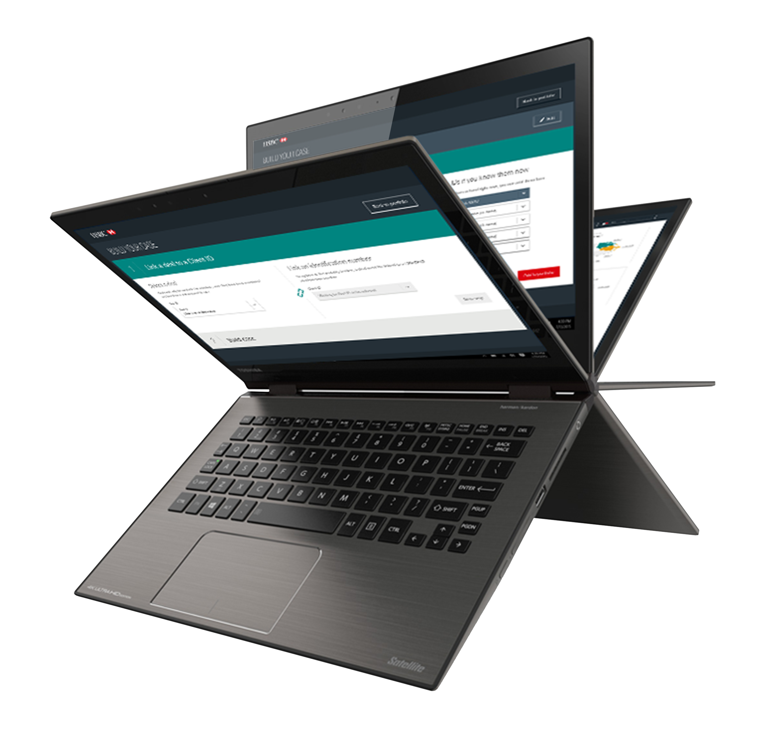
Final Product
The introduction of this innovative tool significantly increased the bank's new customer onboarding efficiency by over 63%, as measured by the reduction in time to completion and a marked decrease in customer complaints. This positive outcome also resulted in a knock-on effect, fostering improved internal communication and promoting greater tool adoption across various other teams within the organization.