
3D Cloud
Kitchen Visualiser
Project Type: New B2C Product Development
Primary Tools Used: Figma, Jira, Slack, Playbook UX
Overview
Lowe's expressed concerns about the low traffic to their flagship Kitchen Planner tool and questioned its value to the company, particularly regarding whether the cost of renewing the contract with 3D Cloud was justified. We had ample data demonstrating that the tool was performing well, with a conversion rate above 60% for users who accessed it, exceeding our contracted target but still falling short of expectations.
To address this, we analyzed how Lowe's was directing users to the tool and discovered that it was only promoted through a single banner located at the bottom of the kitchen project homepage. Unfortunately, the team responsible for this page within Lowe's was not the same department we were working with, and they had little incentive to further promote the tool. To resolve this, we created a new landing page for the Kitchen Planner, which we named the "Kitchen Hub." This page provided users with access to a suite of complementary tools, including the Kitchen Visualiser.

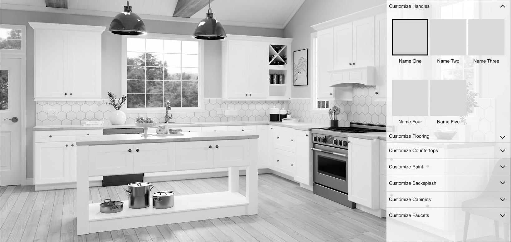
The task
Develop a top-tier, on-brand kitchen visualiser that enables users to seamlessly switch between styles, finishes, and accessories to find their ideal design, ultimately guiding them to schedule a kitchen design consultation.
The tool must be capable of exchanging data with other tools, building a comprehensive customer portfolio that can be shared with a designer prior to the consultation.
My Approach
Since the Visualiser needed to integrate with data from other tools, it could not be designed in isolation. We began by creating a comprehensive user map/flow to identify all potential touchpoints. We presented this flow to the team at Lowe’s, who clarified that they did not intend for users to engage with the tools in a linear fashion. Instead, they wanted users to have the flexibility to use the tools in any order, with the second tool preloading data from the first. As the session did not require logins, this data would be cookie-based and would only persist within a single session.
Given that the Estimator tool shared the most overlapping elements with the Visualiser based on our flows, we implemented a "Change Layout" button. This feature allows users to modify previously selected choices in one centralised location.

To begin designing the visualiser wireframes, we first needed to identify all the elements that would require customisation and determine the number of options available for each. Once this information was gathered, we could then begin considering the optimal layout for displaying these elements on the screen.
We conducted user testing on the wireframes, which received positive feedback. Users expressed a desire for the ability to style cabinet runs based on their specific location within the kitchen. They also requested an option to hide the menu, allowing them to view the full, completed visual. Additionally, some users indicated a lack of confidence in kitchen design and noted difficulty in finding combinations that "looked good." These insights informed the following improvements:

We designed the visualiser with flexibility in mind, ensuring that it can be easily adopted and customised to meet the specific needs of any client. For example, this is the layout we developed for Howdens.
